

You're holding a beautiful titanium cutting board, mug or plate, and the blank surface is creating more pressure than inspiration. A name feels obvious. A date may feel too formal. A long quote looks meaningful on screen, yet suddenly seems crowded when you imagine it permanently marked into a premium object.
Good engraving ideas start with the product, not a list of sentimental phrases. Titanium rewards clean decisions about contrast, placement, spacing and message length. It isn't a forgiving canvas where you can keep adding detail without changing the result. The strongest personalisation feels considered at a glance, remains easy to clean, and still makes sense long after the occasion has passed.
Why Titanium Demands a Different Engraving Mindset
Uncoated titanium gives you a refined, durable surface, but it won't disguise a poor design. Wood can soften an ornate mark. Coated metal can provide a predictable colour contrast. Titanium's natural finish, including the shifting tones found in heat-treated pieces, makes every line part of the object's visual character.
That's why the first decision isn't “What should I write?” It's “What deserves to stay on this object?” A single initial, a family name, a meaningful place or a compact line-art symbol can work beautifully. A paragraph often turns a calm surface into a noticeboard.
Titanium's corrosion resistance is part of the reason it suits long-life kitchen objects, and this explanation of corrosion resistance helps put the material choice in context. The engraving still needs its own practical review, especially if the item will be washed, handled regularly or used around food.
Start with four decisions
Before approving artwork, answer these questions:
- Who will use it? A partner's daily mug needs a different mark from a hospitality team's shared cookware.
- Why is it being given or bought? A wedding, housewarming, chef milestone and personal purchase each call for a different emotional register.
- Which object is carrying the message? A cutting board has active preparation zones. A mug has a viewing side. A plate needs an edge that remains useful and legible.
- How much restraint can the design take? Titanium usually looks more premium when the engraving leaves breathing space around it.
These questions prevent a common custom-order mistake: choosing wording first and trying to force it into the object later. The surface should determine the scale, line count and position.
Practical rule: If the idea needs explaining before the recipient understands it, shorten it or choose a more personal symbol.
Treat the blank titanium piece as premium real estate. The mark should support the object's purpose, not compete with it.
An Australian Tradition of Marking the Things That Matter
A family name on a titanium board, a place on a travel mug, or a compact symbol on a plate works because it identifies the object without overwhelming it. Australia has a long record of using durable surfaces to preserve names, movement and association. That history offers a useful standard for modern engraving: make the mark specific, legible and suited to the material.
At Sydney's North Head Quarantine Station, archaeological research documented 854 inscriptions across 11 precincts around the former facilities at Spring Cove. The station operated from 1828 to 1984, during which approximately 580 ships and more than 13,000 people were quarantined there. The archaeological study of the North Head inscriptions records initials, dates, ship names, place names, symbols and more complex engraved compositions.
The strongest lesson is the choice of information. Text appeared in 87% of the assemblage, or 744 inscriptions, while 63.8% consisted exclusively of text. Dates appeared in 24%, ship names in 14.3%, and place names in 5.3%. These marks gave identity, movement, memory and association a durable form. They were purposeful, not surface decoration added to fill space.
Why the history matters for kitchenware
The same principle applies to contemporary titanium kitchenware. A mug can carry a place linked to a shared trip. A board can hold a family name. A plate can use a small symbol that identifies a household or occasion. Keep the wording short, then match its scale and placement to how the object will be handled.
Material behaviour reinforces that approach. 93% of the North Head examples involved stone-working methods such as engraving, compared with 6.9%, or 59 examples, produced as paintings. Marks cut into a durable surface have a different presence from decoration applied over it. On titanium, a restrained engraving supports daily use and gives the object a considered, lasting identity.
Engraving remains a recognised specialist occupation. Jobs and Skills Australia defines engravers as workers who inscribe letters, figures and designs onto materials including metal, glass, wood, rubber and plastic. Complementary Australian directory data identified 1,123 engraving businesses nationwide as of March 2026, with 220 in New South Wales and 211 in Queensland. The service has an established local place, rather than being an improvised finishing step.
Choose a name, place, date or association that deserves to stay visible. Leave enough titanium around it to keep the object useful and the design confident.
A Four-Question Framework for Choosing Engraving Ideas
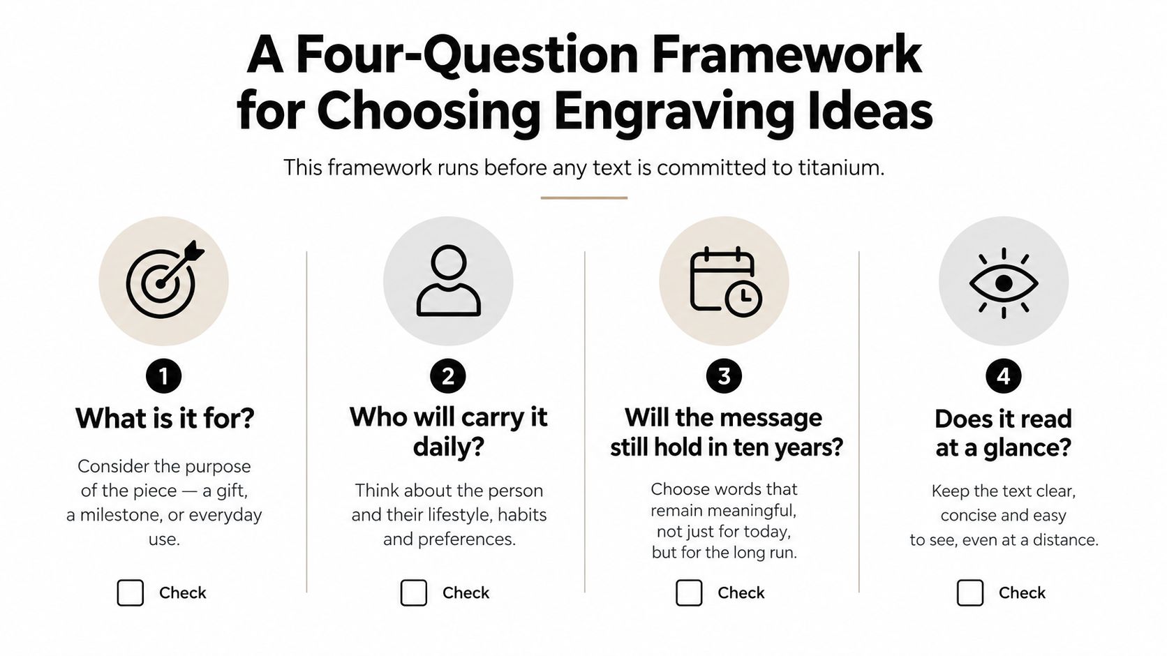
Most idea lists begin with wording. That's backwards. Start by narrowing the emotional and practical job the object needs to perform, then choose the smallest mark that does it well.
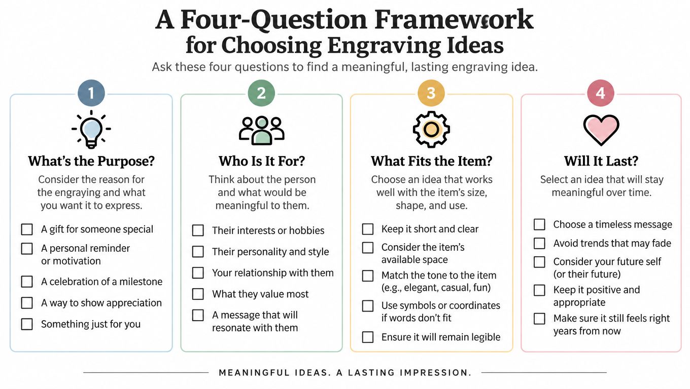
1. Who is receiving it?
A couple can share a place, coordinate or private reference. A parent may respond better to a family ritual, a familiar phrase or the children's initials than to a generic declaration of love. A professional chef usually needs something sharper, such as initials, a service date, a restaurant mark or a compact kitchen-related identifier.
The relationship should decide the language. If the recipient uses the object every day, choose something they'll recognise without feeling watched by it.
2. What carries the occasion?
A wedding supports a shared date, location or simple monogram. A housewarming suits a family name, suburb reference or a functional mark such as “Prep” or “Serve”. A chef milestone can take a service year, initials or a single-line venue logo. For self-purchase, choose the detail you'd want to keep seeing after the buying moment has disappeared.
Customised gifts were reportedly the top wishlist category for 36% of Australian holiday shoppers in 2025, according to Australian ecommerce reporting on festive shopping and personalisation. That demand makes the choice more important, not less. A personal item shouldn't feel like a template with a name inserted.
3. What does the object do?
A cutting board belongs to preparation, so a corner monogram or family mark is more appropriate than a large central message. A mug is part of a daily ritual, which makes side placement or a discreet base mark useful. A serving plate can carry a restrained edge inscription, while cookware benefits from a handle or base location that doesn't interfere with use.
For broader industrial and commercial inspiration, laser engraving ideas for industry can help you think beyond names and dates, particularly around identifiers, logos and repeatable marks.
4. Will less say more?
Usually, yes. Titanium is a long-life material, so the message needs to outlast the mood of the occasion. A coordinate can preserve a shared place without explaining the whole story. A date can mark a beginning without turning the object into a timeline. An inside joke can carry more warmth than a borrowed quotation because it belongs to the relationship.
Use this final test: remove one word, one line or one symbol. If the idea becomes clearer, keep the shorter version.
Fonts, Sizes and Spacing That Survive Daily Use
Typography is where attractive concepts become disappointing products. A font that looks elegant in a large digital preview may lose its character when reduced to one clean line on titanium.
A geometric sans-serif is the safest starting point for most kitchenware. Its open counters, consistent strokes and simple forms remain readable when the mark is small. A restrained serif can work for initials or a short family name, especially on a formal serving piece, but delicate serifs need careful testing. Script fonts are the highest-risk choice. They can suit a romantic gift, yet connected letters, flourishes and thin strokes often become difficult to read once the design is scaled down.
Compare the main type choices
| Typeface approach | Strength | Risk | Best use |
|---|---|---|---|
| Geometric sans-serif | Clear, modern and consistent | Can feel generic if overused | Names, initials and short identifiers |
| Quiet serif | Formal and distinctive | Fine details may disappear | Serving pieces and family names |
| Script | Personal and expressive | Low legibility at small sizes | Very short marks with generous space |
| Monogram symbol | Compact and memorable | Can become decorative rather than meaningful | Corners, bases and professional gifts |
Read the proof at the distance where the object will normally be used. A mark viewed from arm's length needs a different decision from lettering intended to be noticed across a dining table. Don't approve artwork solely because it looks sharp when enlarged on a screen.
Spacing matters more than decoration
Generous letter-spacing usually performs better than tight tracking. The space between letters helps the eye separate characters against titanium's natural surface variation. Tight lettering may appear polished in a mock-up but can turn into a dark, compressed strip after marking.
Keep line weight consistent, and avoid punctuation unless it contributes meaning. A dot, slash or repeated separator can create visual noise on a small mark. If a long name needs abbreviation, use the recipient's familiar form rather than forcing a formal version into a crowded zone.
Design-for-production guidance is useful here. Design for manufacturing principles reinforce the need to account for production constraints early, rather than treating them as a final-stage correction.
For Everti pieces, including the iridescent Aura collection, test the proposed line weight and placement against the actual finish. The surface's colour variation should remain part of the design, not become an obstacle to reading. Before ordering, also consider whether scratches on a titanium cutting board are safe, because the object's use pattern should influence how subtle or exposed the mark can be.
A good proof should look slightly underworked. If the engraving dominates the product image, it will probably dominate the object.
Placement Ideas for Cutting Boards, Cookware, Drinkware and Tableware
Placement should follow use. The right location keeps the mark visible enough to feel intentional, but away from the areas that receive the most contact, heat, abrasion or food residue.
| Product | Recommended Zone | Typical Mark | Visibility |
|---|---|---|---|
| Cutting board | Corner or outer margin | Family name, monogram or compact icon | Visible during prep, not dominant |
| Cookware | Handle, underside or exterior base | Initials, venue mark or short identifier | Discreet |
| Drinkware | Side panel or base | Name, coordinate or daily ritual mark | Side is high, base is low |
| Tableware | Outer rim or underside | Family name, date or serving mark | Seen at the table |
Cutting boards
Keep the mark out of the main knife path. A corner monogram, short family name or small line-art icon remains visible during preparation without making the working surface feel branded. Don't place a deep or complicated design where scraps, oils or moisture will collect.
A board intended for a family kitchen can take a surname or a compact place reference. A professional board may suit initials or a service-related identifier, but the result should still look at home in a working kitchen rather than like industrial inventory.
Cookware
Handles and exterior bases provide natural zones for personalisation. A short name, monogram or venue mark can sit where it's easy to identify the item without interrupting cooking. Avoid placing artwork across a gripping surface, a sealing interface or any area where residue could gather.
Heat and washing also make restraint essential. The most suitable mark isn't necessarily the deepest one. A smooth, controlled finish that remains easy to wipe can be preferable to a recessed design with unnecessary texture.
Drinkware
Side placement works for a personal mug or travel cup because the recipient sees the mark during use. A base mark is more discreet and suits a shared gift, a hospitality setting or a design that should reveal itself subtly.
Use the object's natural handling direction. If the user holds the cup with the right hand, place the mark where it faces them, not where it turns away. For comparison, a personalised champagne flutes guide offers useful context on how drinkware personalisation can balance visibility with the shape of the vessel.
Tableware
An outer rim or underside is usually better than a central engraving. The edge catches attention as the plate is set down, while the centre remains available for food presentation. A family name, date or small symbol can feel ceremonial without becoming the focal point of the meal.
Before approving any concept, ask whether the mark will remain easy to clean and comfortable to handle. Buyers should also ask whether the surface is coated or uncoated, what process creates the mark, whether the finish affects food-contact use, and what washing guidance applies.
Co-Brand and Professional Engraving Programs
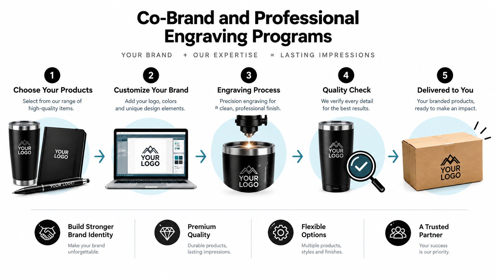
A business order needs a production brief, not a mood board. Give the engraving partner artwork that can be repeated accurately, a defined placement zone and a clear approval process.
Start with vector artwork wherever possible. For a small co-brand mark, a single-line logo, a compact monogram or a short alphanumeric identifier usually scales better than a detailed badge. For a defined personalisation area, a 20–40 mm monogram zone gives the production team a practical starting point while keeping the design controlled.
Build the brief around repeatability
A production-ready brief should state:
- Artwork: Supply the approved vector file, including any alternate lock-up for smaller products.
- Placement: Identify the exact zone, orientation and alignment reference.
- Text: Confirm spelling, capitalisation, abbreviations and character limits.
- Finish: Describe the intended visual result without assuming that a deeper mark is automatically better.
- Proofing: Require approval of a product-specific proof before the batch begins.
- Inspection: Record the approved artwork, material, machine class, operator and inspection result for each batch.
Australian laser-safety guidance identifies material chemistry as a primary constraint. PVC, PVB, PTFE, halogen-containing materials, phenolic or epoxy resins and some flame-retardant materials can release hazardous gases, dust or corrosive by-products during processing. Australian material guidance for laser processing recommends checking technical documentation, and Australian university procedures place laser use under AS/NZS IEC 60825.1 and AS/NZS IEC 60825.14 requirements.
For titanium essentials, direct metal marking is the defensible approach. Don't add vinyl, resin or an unknown polymer overlay just to create contrast. Request the substrate documentation, test the proposed settings on a sample, and retain the approved material and parameter combination.
Keep the operator and customer safe
A scalable program should use an enclosed, controlled marking station operated by trained and authorised personnel. Australian laser-safety procedures cover protective housings, labelling, controls, positioning and safe operation. The process should reduce unintended viewing and require the machine to be powered down before protective covers are opened.
For an Everti co-brand order, custom engraving online is the natural starting point for discussing the product, artwork and proof requirements. Keep the same core artwork across formats, but don't force identical sizing onto every object. A mark that reads clearly on a board may need a shorter version on a mug or handle.
Why Restrained Engraving Ages Better
A long quote is not automatically more personal. On a daily-use titanium object, it can look heavy, become harder to read and feel awkward in a shared kitchen.
Choose a mark that suits the object, its finish and the recipient's habits. one initial, a coordinate, a clean date, a family name or a short inside joke gives the piece a clear association without demanding attention whenever it is used. Keep public wording simple, and let the private story stay with the recipient.
The earlier North Head record supports that preference for short, legible marks. Text dominated the assemblage because it identified a person, time, movement or place without covering the surface. The Australian archaeological record shows why a concise mark can remain useful: it preserves an association rather than merely filling available space.
Before approving the proof, remove wording that only explains the message. Retain the detail that makes the recipient recognise it. Set the font, size and placement for titanium's real use, not for a crowded design preview. The finished object should feel considered, with a personal signature rather than excess copy.
Choose the recipient, occasion, object and level of restraint before finalising the wording. Everti offers custom engraving on titanium kitchen and table essentials, including names, dates, initials, messages and brand elements. Visit Everti to select a piece and request a durable, well-proportioned mark.